Aurora Mental Health & Recovery Brand Identity
Visual Identity, Branding, Marketing Campaign

Overview
Aurora Mental Health & Recovery (AMHR) is a large, not‑for‑profit community mental health organization that provides a wide range of mental health and addiction services to anyone and everyone in need.
For those who live outside of the Denver metro area, the city of Aurora often “lives in the shadow” of the larger and more affluent city of Denver. It has made national news in the past decade on multiple occasions due to large scale mass tragedies and social injustices — all of which directly correlate to the mission and purpose of AMHR. In spite of Aurora’s turbulent history, the people who make-up Aurora Mental Health & Recovery are inexcusably proud of being from and serving their community.
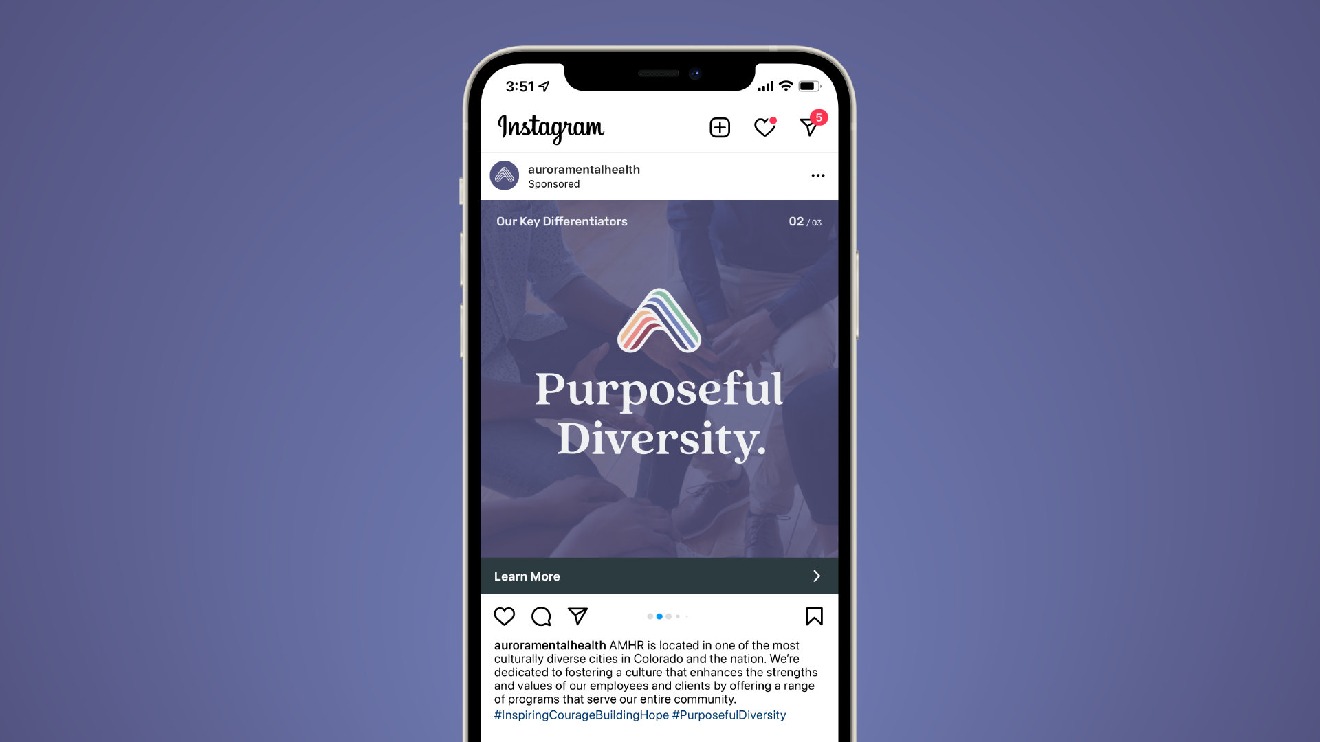
As part of a full-scale rebrand including messaging, positioning, and a visual identity system, the organization’s name was changed from Aurora Mental Health Center to Aurora Mental Health & Recovery in order to put greater emphasis on their addiction and recovery services — a clear differentiator between them and other regional clinics in the Denver metro area.
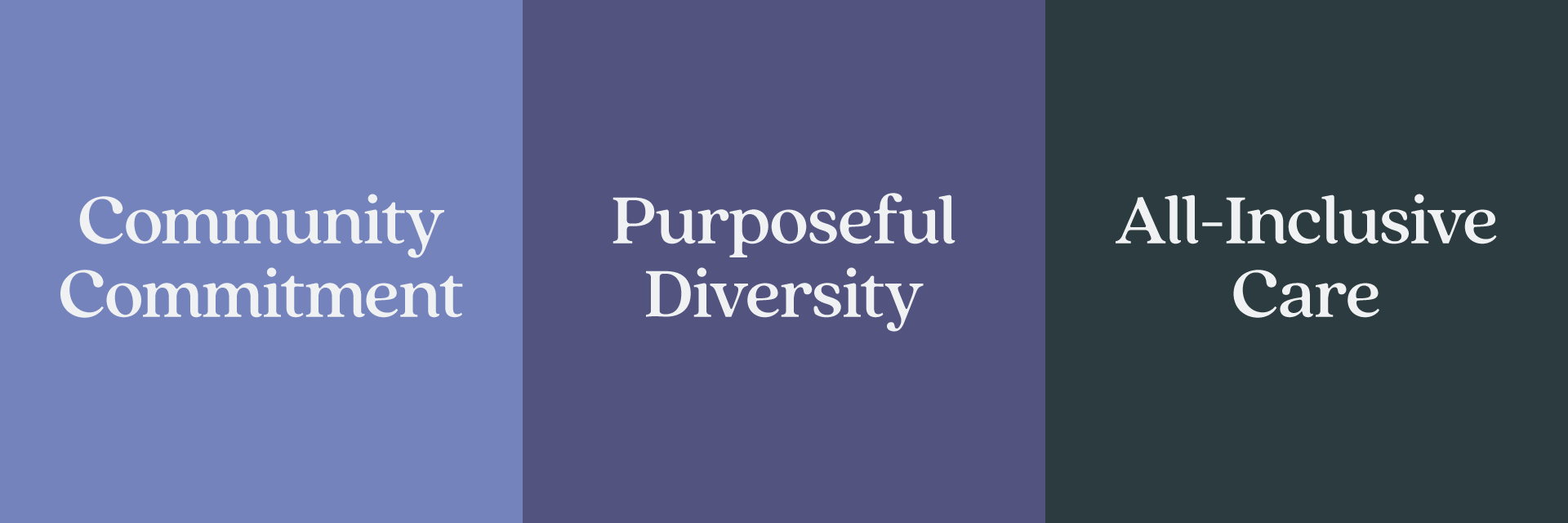
Three key differentiators drove the reworked messaging and visual identity:
Since 1975, Aurora Mental Health & Recovery has been devoted to being good stewards for the Aurora community by providing trust, leadership, and healing through resources, services, and education.
Located in one of the most culturally diverse cities in Colorado and the nation, Aurora Mental Health & Recovery is dedicated to fostering a culture that enhances the strengths and values of our employees and clients by offering a range of programs that serve the entire community.
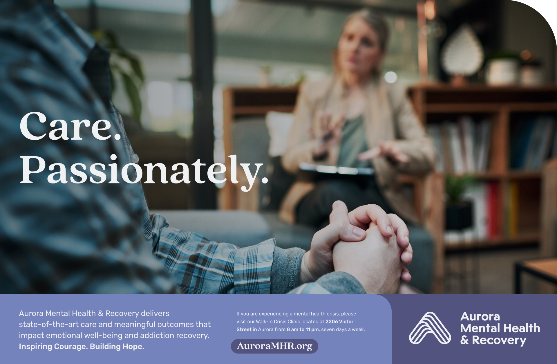
Behavioral health needs impact anyone — and everyone deserves accessible, judgment-free care. AMHR offers a wide-range of proactive programs and services that meet all people where they are, regardless of their age, diagnosis, or socioeconomic background.


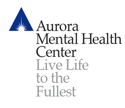
The old logo (obviously) and tagline — in a very clunky and hard to work with lockup arrangement.
The old mark was inarguably dated and suffered from numerous abuses and design crimes over its storied history. While hinting at the shape of an ‘A’ for Aurora, there was plenty that could be easily improved upon to instill a sense of place — something of the utmost importance for this client.
As an aside, as I’ve lived in different places around the country I’ve come to realize that businesses in certain cities have de facto logos of sorts — in St Louis, near everything defaulted to the Gateway Arch — here in Denver, the Front Range mountains are a common design trope … you get the idea.
For those unaware, the city of Aurora is located on the eastern side of the Denver metro area, and with the rate that they are annexing land, could arguably considered Kansas. (For reference, the foothills and mountains are west.) All that to say, mountains aren’t necessarily the best choice for a sprawling, mostly flat community.
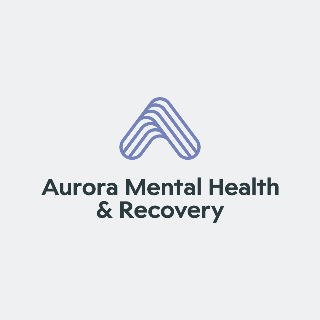
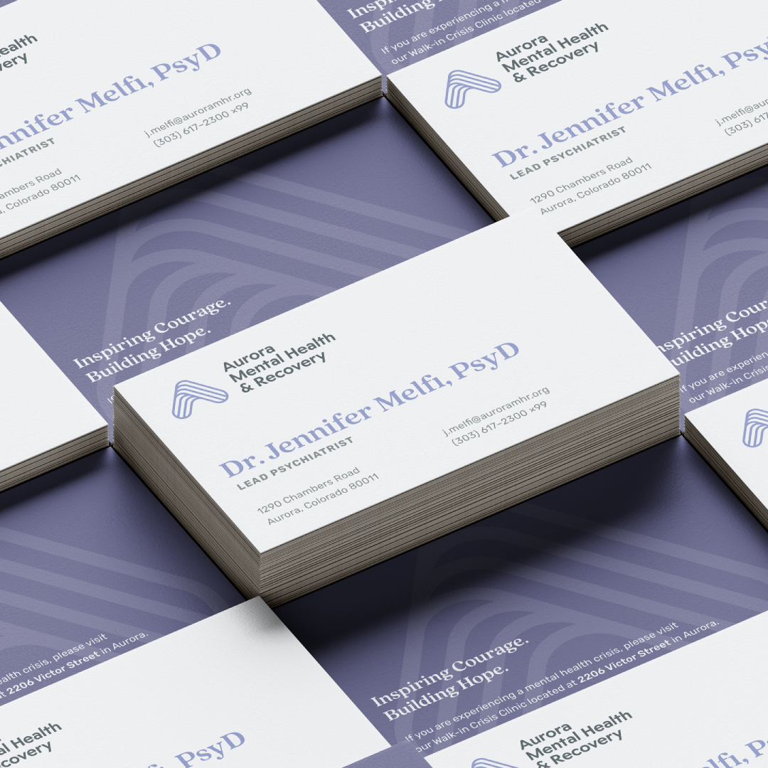
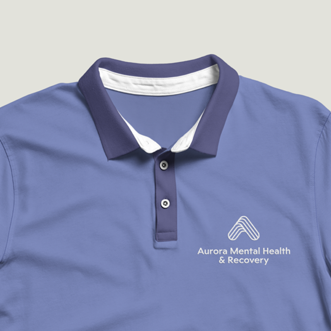
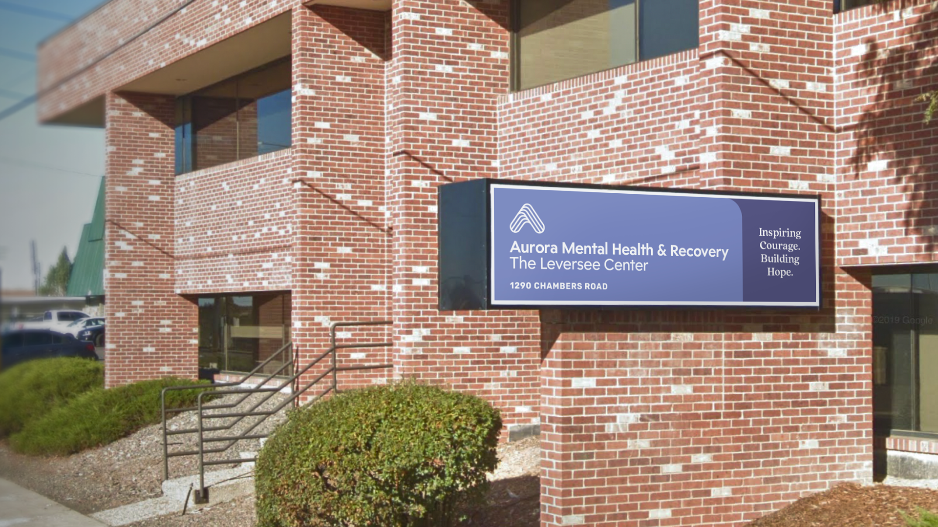
The new mark not only makes the ‘A’ more visible and pronounced, but also more clearly defines the sense of place by incorporating repeating lines reminiscent of crop fields into the shape. These lines are also intended to serve as many different pieces of the community coming together. The overlapping element incorporates a sense of motion representative of the wide array of programming that AMHR offers, all while the shape also doubles as an upwards arrow to reinforce the brand tagline: “Inspiring Courage. Building Hope.”
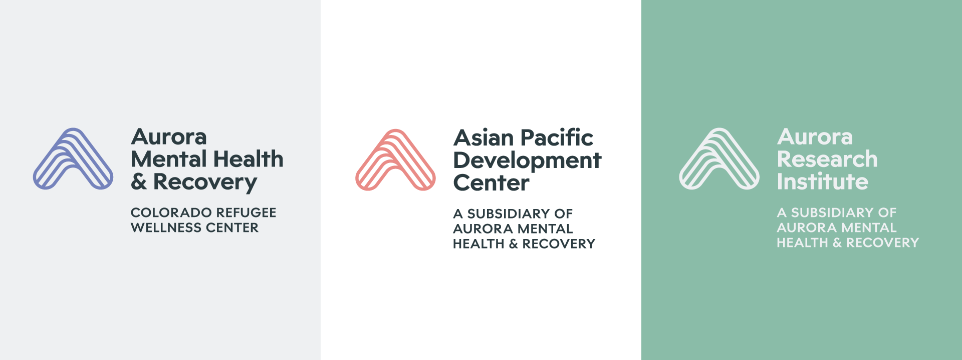
AMHR also had a vide variety of sub-programs and subsidiaries — all with their own marks and logos. Due to this variety, the programming was often hard to identify as being part of AMHR. As part of the rebrand, a larger system standardized these marks and provided distinct colorways for the two primary subsidiaries, all while using the same overarching mark to increase brand awareness for AMHR.

More Work