Saunders Website Refresh
Web Design, UI Design, Wireframing, Real Estate Development
Overview
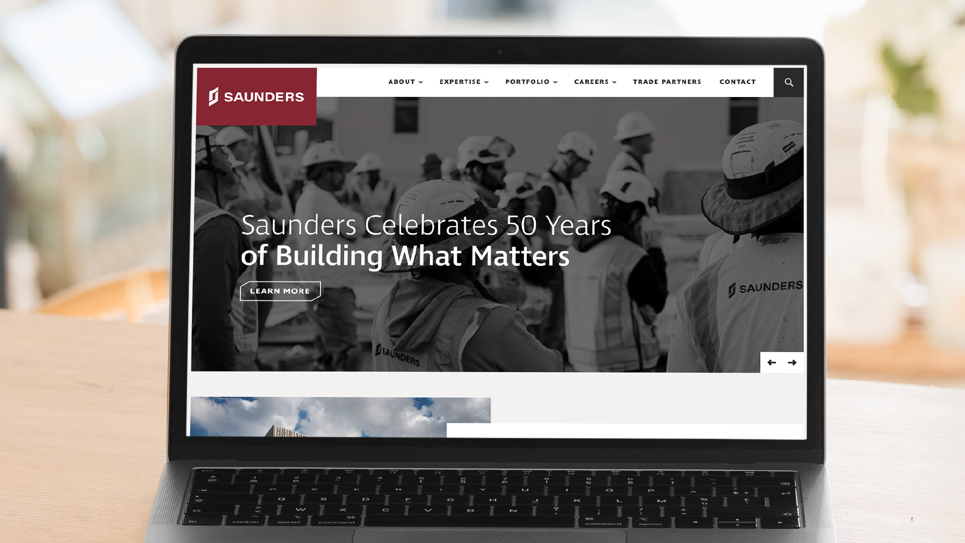
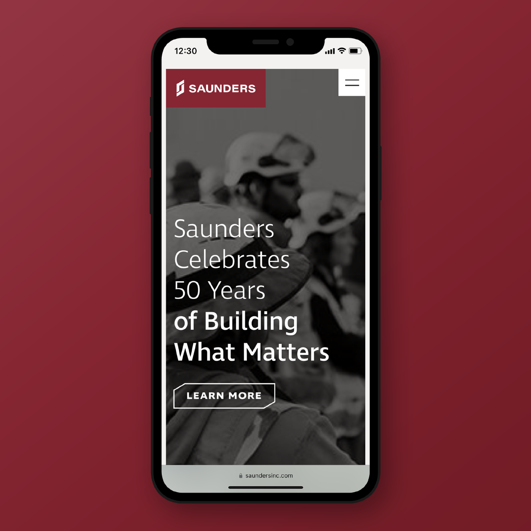
Saunders Construction is a premier construction management and real estate development company in the Denver, the greater Colorado market, and around the country. Their previous website accompanied their re-brand several years ago, but quickly became dated and clunky as their portfolio and services grew over time. The refresh focused on maximizing what made their brand great, alongside making the site easier to use and implementing accessibility guidelines and best practices.
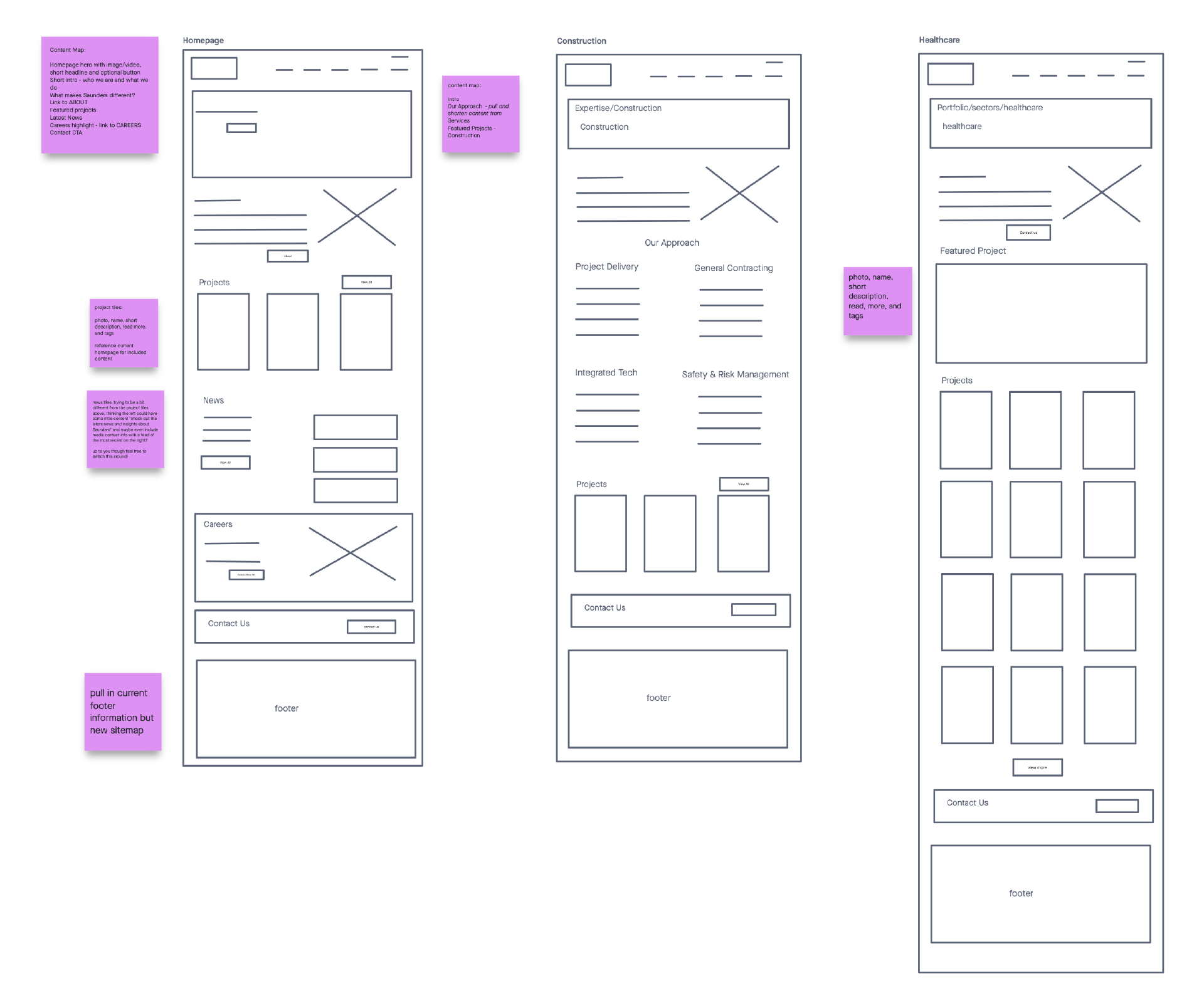
Wireframes
An initial team interactive white boarding session determined the pages and elements that needed to be put into wireframes before heading into design. Site structure and flow was completed by another team prior to the start of the wireframing process.
Web Designs
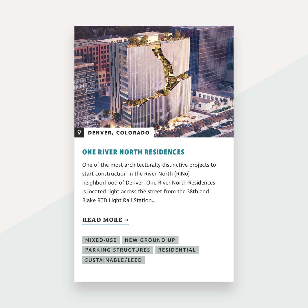
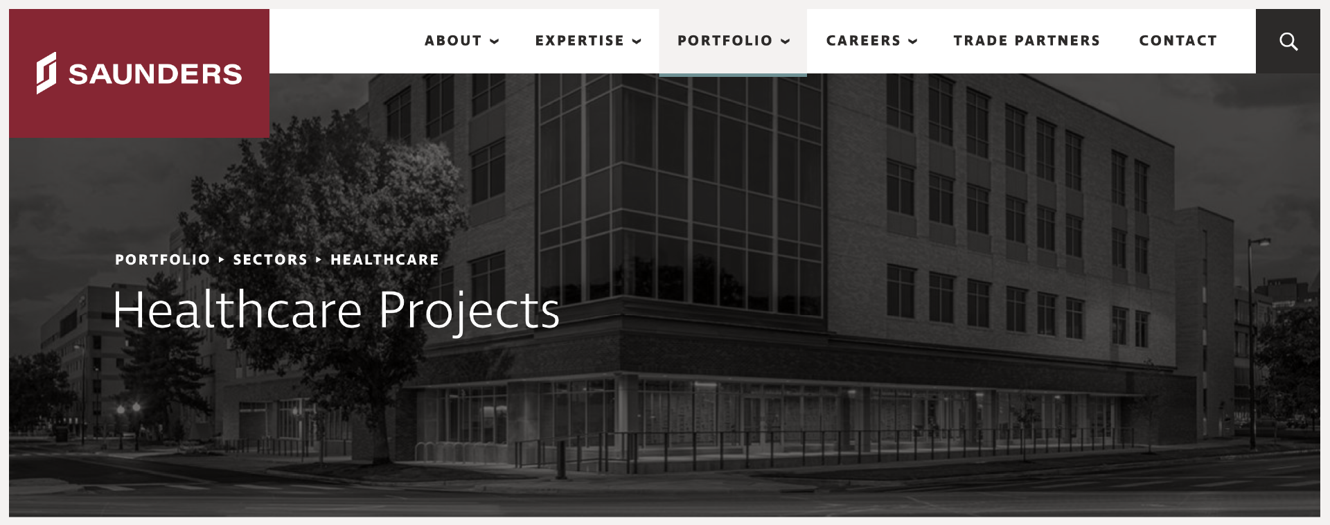
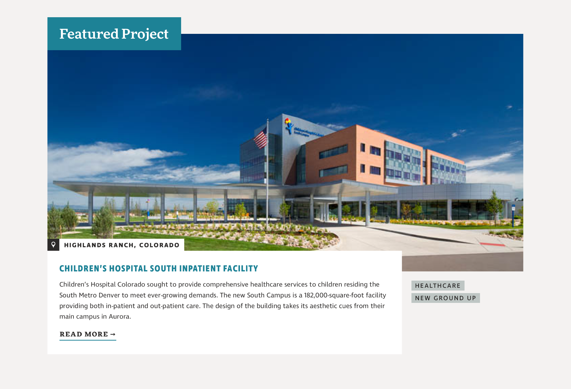
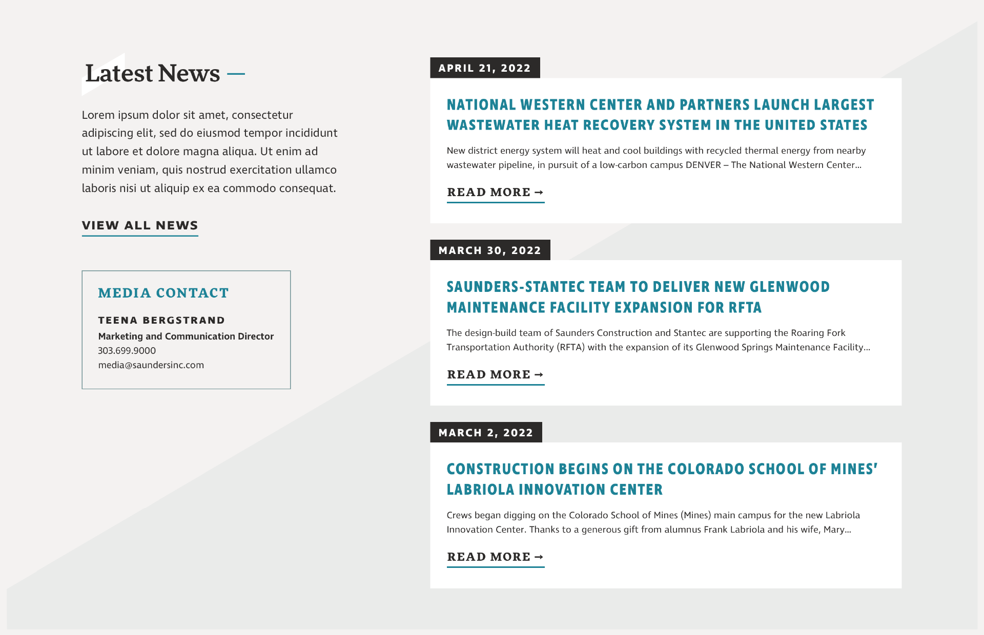
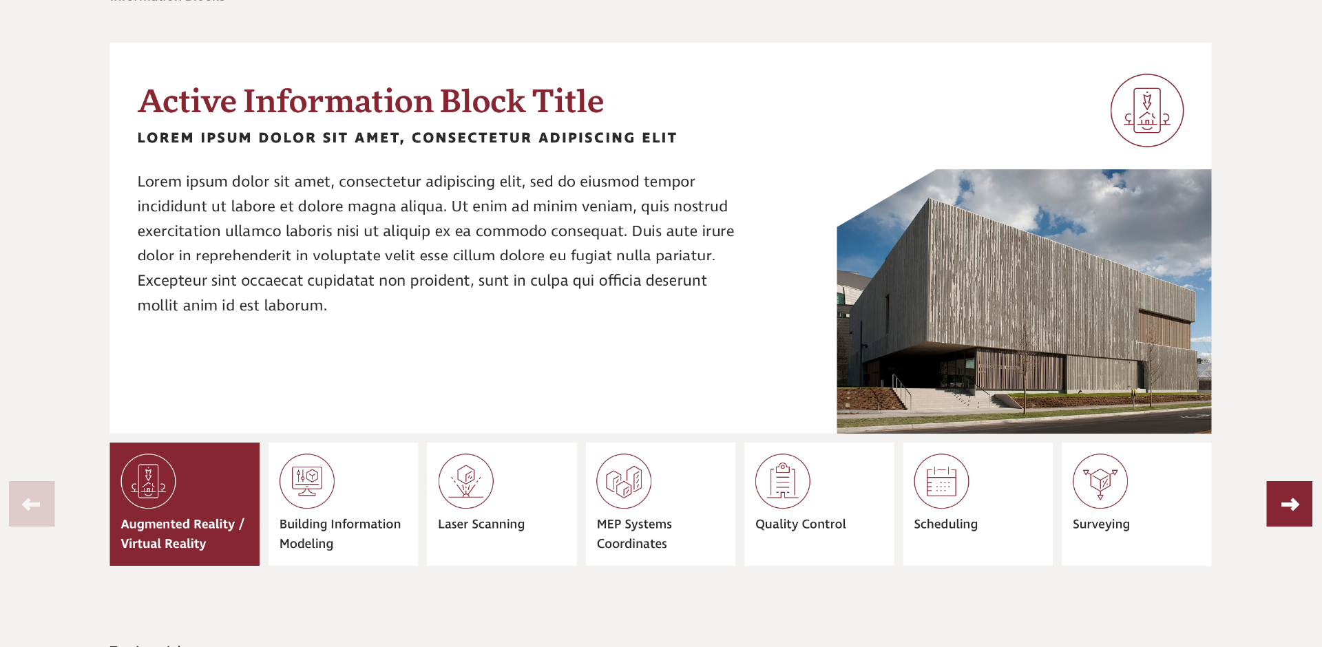
The angular treatment of the logo inspired a focus on geometric and overlapping elements throughout the UI, which helps to create a sense of depth on the site as elements literally “build” on top of each other. The inclusion of a secondary teal from their brand helped to balance the strength of the core maroon color and made the site less abrasive and more approachable. The brand type was also augmented to include a greater emphasis on the serif type (FF More) — with over 50 years in the industry, its inclusion is a subtle nod to Saunders’ longevity and expertise, while also adding a sense of sophistication and reputability without completely losing the modern touch found in the sans (Ingra).
Page Builder
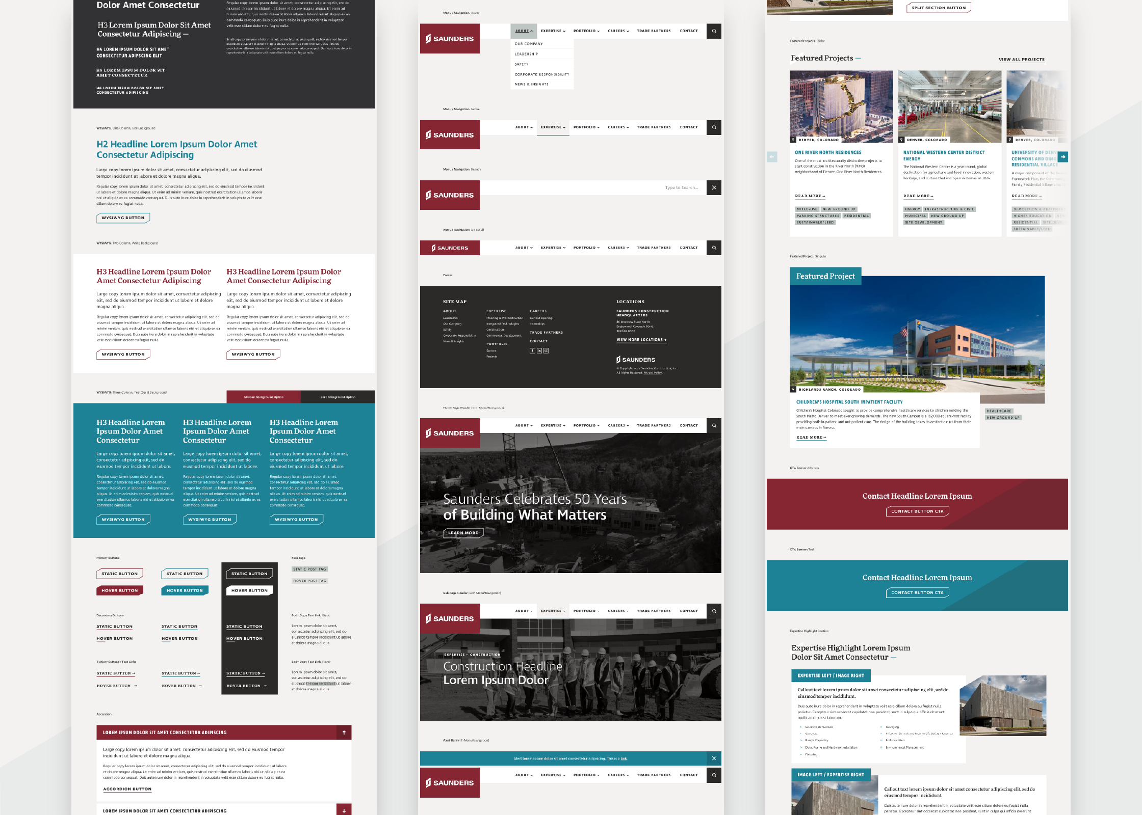
After select page designs were approved, a page builder featuring additional site-wide modules, elements, and interactive states was built out to aid the development team during hand-off.
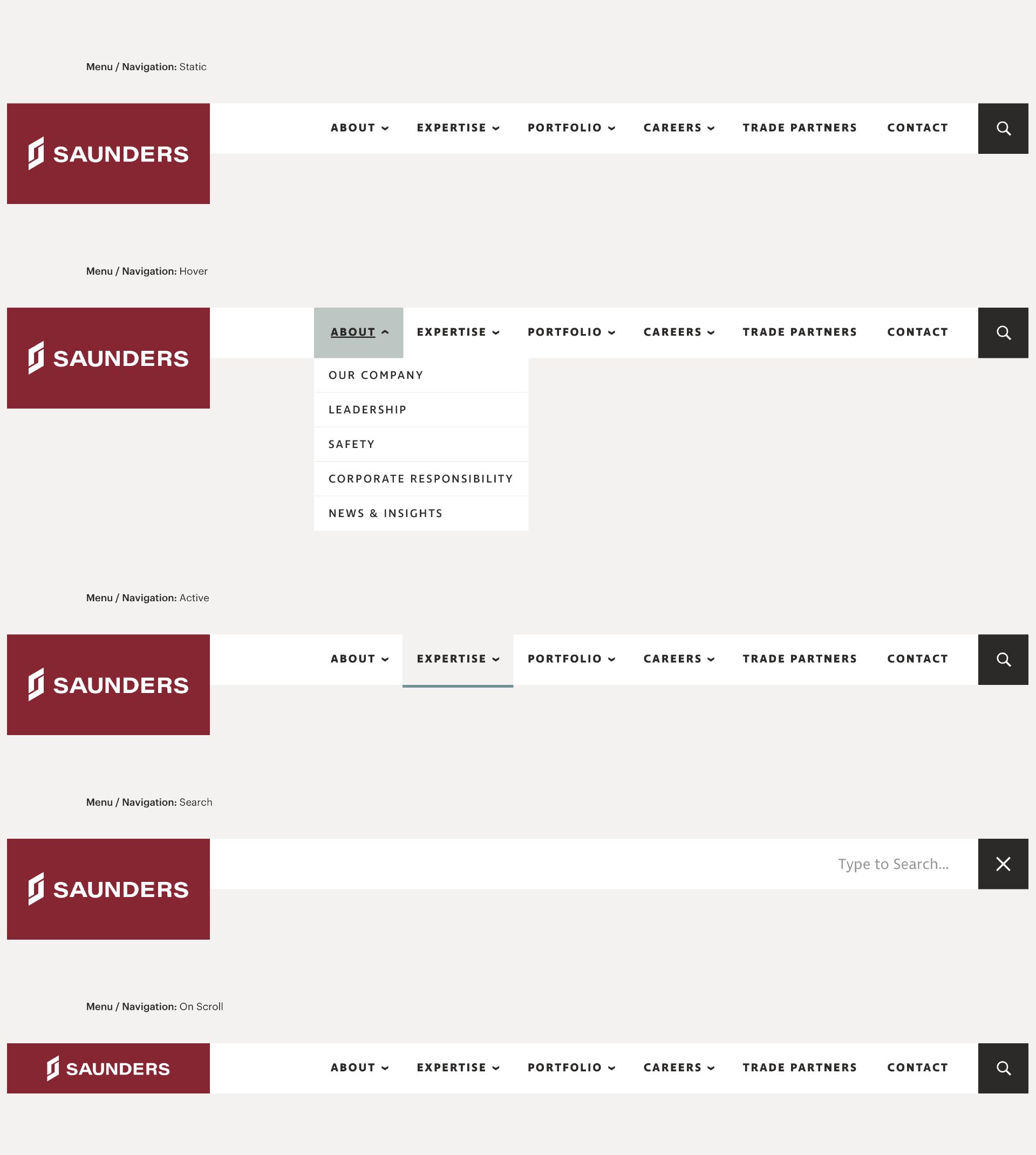
Different interactive states for the primary variegation including hover, active, and showing how search functionality would work.
More Work